
Selecting the ideal visual style is crucial for creating an effective animated infographic. The right aesthetics make your information pop, delight viewers, and optimize recall.
This comprehensive guide explores the top styles and best practices for choosing animations that captivate audiences. Follow these tips and your infographic is guaranteed to impress!
The Powerful Benefits of Animated Infographics
Let’s first discuss why animated infographics are so effective compared to static designs.
Unparalleled Viewer Engagement
Animation instantly grabs attention in a way static graphics can’t. In the first 2 seconds, our brains process visual content 60,000 times faster than text alone. This hyper-stimulation triggers powerful emotional responses and memories.
Studies show we’re more likely to remember details from animated content compared to static designs. For example, one study published in the Psychonomic Bulletin & Review Journal found that both monochrome and color-moving images are better remembered than static versions of the same stimuli at retention intervals of up to one month
Animation makes processing information easier and more enjoyable for our brains.
Ideal For Complex Topics
Animation excels at simplifying complexity. It can clearly convey sophisticated processes, relationships, trends, and data points through dynamic motion and visual metaphors.
Even dense, boring subject matter becomes more interesting and approachable with animation. Viewers comprehend complex topics more easily thanks to engaging motion, audio, and interactivity.
Broadens Accessibility
Animation appeals to diverse learning styles, including:
- Visual learners who comprehend through images, charts, and diagrams.
- Auditory learners who absorb information well through audio narration and sound effects.
- Kinesthetic learners who prefer hands-on interactivity and simulations.
Animation incorporates all these modalities, ensuring your infographic engages every type of audience.
Drives Action and Conversion
Compelling animations don’t just inform, they motivate action. The emotional impact and immersive experience convert passive viewers into engaged participants primed for conversion.
For example, Crazy Eggs increased conversion rates by 64% by adding animated demos to their website. Animation’s ability to stimulate and persuade is perfect for driving action.
Now that we’ve covered why animation is so powerful, let’s explore how to choose the right visual style.
Factors For Choosing Your Visual Style
Every animation decision should ladder up to your core goals and audience. Consider these key factors:
Message and Communication Goals
Your visual style should strengthen your central message and communication objectives.
If your goal is to inform audiences on serious topics like science or finance, consider credible aesthetics like flat, outline, or isometric designs. The professional polish reinforces your expertise.
If you want to entertain and build rapport, choose friendlier styles like cartoon, hand-drawn, or retro. The casual vibe makes learning enjoyable.
If you aim to persuade people to take action, stimulate them with lively animations. Fun cartoon scenes demonstrating value propositions, for example, motivate viewers to engage.
Target Audience Demographics
Understand your viewers’ demographics, interests, and preferences to select visuals they’ll appreciate.
For professional or mature target audiences like doctors, CEOs, and academics – stylish flat, outline and isometric animations convey competence and authority.
For casual or youthful viewers like students, millennials, and creatives – lively cartoon or hand-drawn aesthetics better suit their sensibilities.
Medium and Content Context
Your visual style should fit the medium where it will be viewed. For example:
- For blogs/articles, clean flat, or outline graphics are readable and scannable on screens.
- For social media like Instagram or Twitter, bold simple styles perform well on small feeds.
- In presentations, cinematic animations with sound help presenters connect with audiences.
- For YouTube/video, dynamic cartoons or isometric animations maintain viewer attention.
Brand Consistency
If designing for a brand, ensure your visual style matches their tone, style, and essence consistently. Avoid clashing aesthetics.
Actionable Tips to Find the Perfect Visual Style for Your Animated Infographic
Creating an engaging and informative animated infographic requires careful consideration of visual style. The imagery, motion, and overall aesthetic should enhance the story you’re telling while capturing viewers’ attention.
With so many options to choose from, how do you select the right look and feel? Follow these tips to find the ideal visual style for your next animated explainer.
Know Your Audience
Before deciding on a visual style, get very clear on who your target audience is. Their demographics, interests, and preferences should guide your choices.
For example, millennials may appreciate a bright, modern flat design while baby boomers could respond better to a more subdued retro style. Do audience research to uncover visual trends they find appealing.
Match the Tone
Your visuals need to align with the overall tone and message of the infographic. A serious, data-driven piece calls for a polished, professional style while a fun, quirky topic could use a playful, cartoonish look.
The style should never distract from the information – it should complement and enhance it.
Consider the Subject Matter
Certain visual styles are better suited to specific topics and contexts. For an infographic on technology or science, clean vector graphics and minimalism could work well.
Infographics about nature may benefit from organic shapes and hand-drawn elements. finance and business often do best with conservative styles marked by structure and clarity.
Stock Exchange | Animated Explainer Video by 10 Studio
Use Color Purposefully
Color is one of the most powerful visual tools at your disposal. Different palettes evoke different moods and feelings that can strengthen your message.
Cool blues and greens feel tranquil and calming while warm reds, oranges, and yellows convey energy and excitement. Avoid jarring, overly saturated colors that could distract viewers from your content.
Animated Doesn’t Have to Mean Cartoonish
When people think of animation, cartoons often come to mind first. But today’s technology allows for stunning animation with a range of artistic styles.
Don’t feel limited to a typical “animated” look unless it truly fits your goals. Experiment with styles like cut-out, line drawing, vector, stop motion, 3D and more.
Be Consistent Throughout
Whichever style you choose, be sure to use it consistently across all elements, scenes, graphics, and text. A hodgepodge of competing aesthetics will only muddy your message.
Maintain visual cohesion from start to finish for maximum clarity and impact.
Gather Inspiration
Immerse yourself in designs relevant to your topic to spark visual ideas. Study infographics, animations, and other content in your niche to see what styles connect with your audience. Collect color palettes, fonts, graphical treatments, and compositions you like to inform your own aesthetic.
Carefully considering these key factors will lead you to an informed, purposeful visual style for your animated infographic. Remember to always keep your content and audience at the center of each choice.
With strategic planning and creativity, you can craft a memorable, engaging aesthetic that elevates your message.
7 Top Visual Styles For Animated Infographics
Below we explore the most popular infographic animation styles and their ideal use cases:
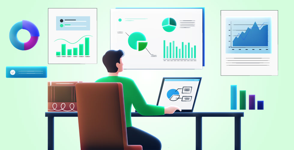
1. Flat Design
Best for: professional, clean, modern aesthetics. Ideal for presenting data and statistics.
Features: simple shapes, solid colors, minimal gradients, clean lines, flat perspective. Avoid shadows and textures.
Use when: you want straightforward data delivery. For business, finance, technology, and science topics. Suits professional, mature audiences.
2. Outline Design
Best for: subtlety, minimalism, elegance, highlighting key points
Features: Thin outline shapes, high contrast, negative space. Avoid fills, gradients, effects.
Use when: you want an uncluttered, sophisticated look. For luxury, arts, fashion, and culture topics. Suits stylish, refined audiences.
3. Isometric Design
Best for: dimension, depth, realistic graphics, dynamic processes
Features: 3D shapes, isometric perspective, shading, depth illusion. Avoid skeuomorphism.
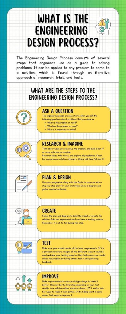
Use when: demonstrating complex systems and processes. For engineering, technology, architecture, workflows. Suits technical and analytical audiences.
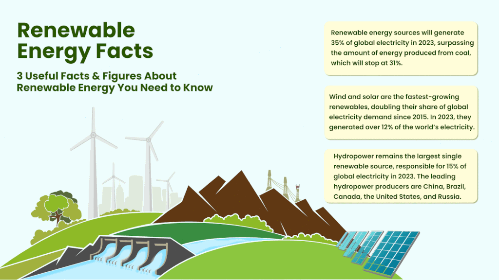
4. Cartoon Design
Best for: fun, engaging graphics, education, storytelling
Features: Characters, illustrations, expressions, humor, relatable visual metaphors.
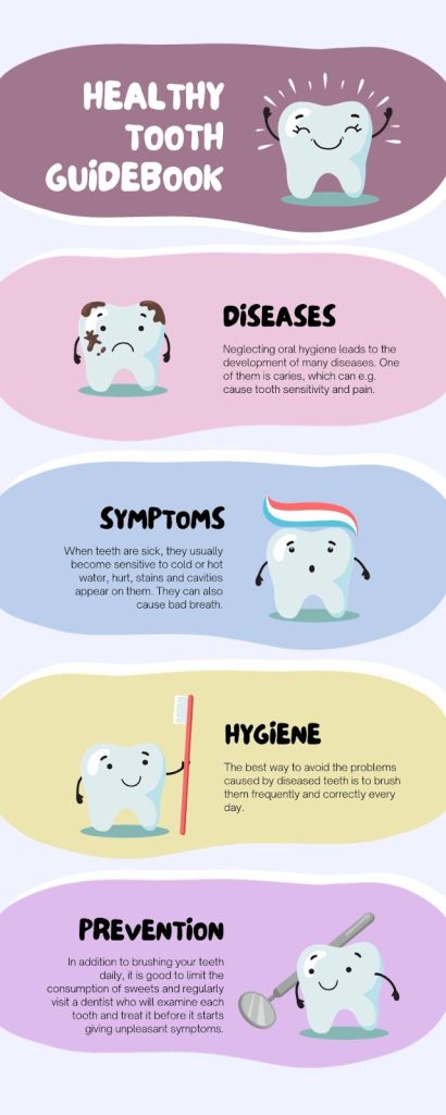
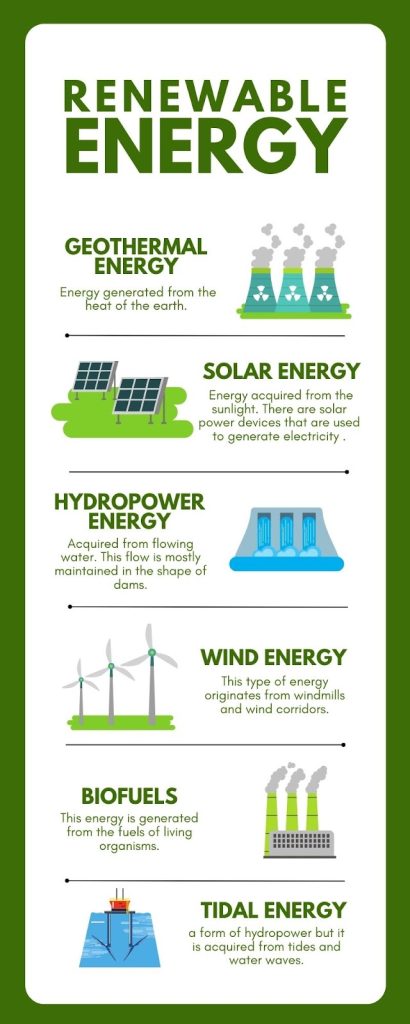
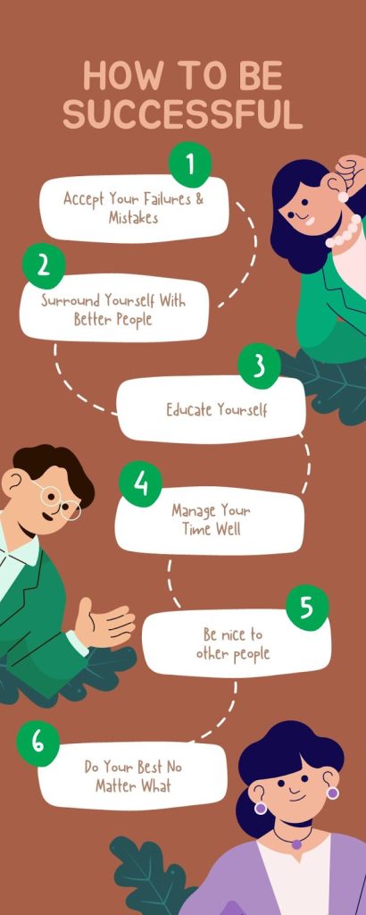
Use when: simplifying complex topics in an entertaining way. For sciences, history, sociology, philosophy, self-help concepts. Suits casual, mass-market viewers.
5. Hand-drawn Design
Best for: artistic, unique, creative, personalized graphics
Features: Sketches, imperfect lines, textured brushes, paint splotches, artistic flair.
Use when: you want an intimate, indie, hand-crafted look. For creative industries and audiences who value originality.
6. Retro Design
Best for: nostalgia, establishing historical context
Features: Pixelated graphics, bright neon colors, retro sci-fi/technology. Evokes 80s/90s aesthetic.
Use when: illustrating past eras and trends. Especially effective for technology, gaming, music, and pop culture topics. Captures nostalgia of target demographics.
7. Paper Cutout
Best for: craft-like dimensionality, scrapbooking aesthetic
Features: Multi-layered paper cutouts, textures, transitions between layers.
Use when: you desire tangible, scrapbook-like textures. For creative topics and audiences who appreciate handmade craftsmanship.
Best Practices For Choosing Visual Styles
To recap, follow these best practices when selecting your animated infographic’s visual style:
- Match the style to your core message and communication objectives
- Consider your target audience’s demographics, interests, and preferences
- Ensure the style fits the medium and context where it will be viewed
- Maintain brand consistency if designing for a company
- Use styles strategically to make information as clear, enjoyable, and memorable as possible!
Conclusion
Selecting the right visual style is crucial for creating engaging animated infographics that delight audiences. Follow the tips in this guide and you’ll craft animations that inform, educate, and inspire viewers to take action!
The optimal aesthetics make complex information approachable, build connections through storytelling, and boost memorability through dynamic motion. With these best practices, you can develop truly outstanding animated infographics guaranteed to achieve your goals.