Explainer videos have become an extremely popular and effective marketing tool for businesses over the last decade. Their ability to quickly communicate complex ideas or products in an engaging, memorable way makes them a perfect vehicle for educating potential customers or clients.
However, creating an explainer video that captivates viewers while keeping things clean, simple, and minimalist can be a real challenge. Videos that are visually cluttered, packed with excessive information, or overly complex end up confusing rather than enlightening.
In this comprehensive article, we’ll break down what makes minimalist explainer videos so effective when done right. You’ll learn the core principles of minimalist video style, the key strategic decisions that go into creating a simple yet impactful video, and actionable tips to implement when crafting your own minimalist explainer.
Why Less is More with Explainer Videos
Minimalism is all about restraint and simplification, eliminating any non-essential elements and focusing purely on the most important core message or ideas you want to get across. This simplicity and efficiency allow viewers to easily digest and retain the key information from your video.
JR Recycling Solutions Limited | Animated Explainer Video by 10 Studio
A minimalist explainer video uses simple shapes, graphics, and color palettes to communicate concepts clearly.
Some of the major benefits of a minimalist approach to explainer videos include:
- Clarity – Removing any extraneous details or complicated graphics prevents confusion and keeps the message clear and concise. Viewers instantly understand the core ideas.
- Memorability – Simpler visuals, narration, and concepts allow the ideas presented to truly stick in the minds of viewers. Minimalism leads to higher recall.
- Cost-effectiveness – Minimalist videos require far less time, creative resources, and production effort to produce. Streamlining the visuals and message saves money.
- Adaptability – A minimalist style allows your video to be more readily repurposed for different social media formats, localized for different languages, or re-edited for various updates. Simple allows flexibility.
- Accessibility – Basic visuals, narration style, and concepts allow viewers with different backgrounds, education levels, languages, and accessibility needs to still understand and benefit from the video.
While “minimalist” may bring to mind something overly simple or stripped down, when done effectively, a minimalist explainer video should still feel visually polished and interesting while also efficient in communication.
Core Principles of Minimalist Explainer Video Style
When planning out a minimalist explainer video, there are several guiding principles to keep in mind:
Focus on Audience Education Over “Selling”
Minimalist videos work best when they aim to inform, educate, and enlighten viewers rather than taking a direct salesy or promotional approach. Keep the experience centered on teaching your audience something valuable rather than getting them to buy or convert immediately.
Protection of Viewers’ Attention Span
Viewers have short attention spans. A minimalist video respects that reality and avoids letting visuals, narration length, or concepts overwhelm or mentally fatigued viewers. Keep things brief, simple, and consumable.
Strategic Use of Contrast
Leverage contrast in visuals, motion, narration pacing, and ideas presented wisely. The juxtaposition of differences creates engagement and energy. Just be sure to balance contrasts with enough simplicity as well.
Thoughtful Use of Negative Space
Negative space, or empty areas around graphics and text, is a key aspect of minimalism. It prevents visual crowding and allows the important elements to stand out cleanly. Don’t be afraid of that breathing room!
Efficiency of Communication Above All
Always evaluate if a visual element, transition, narration line, or overall video concept is absolutely essential. If not, it likely should be removed or simplified even further to keep communication pure and efficient.
Keeping these principles in mind from the outset will ensure you stay on track for a minimalist explainer video style even with the complexity of ideas. Next, let’s look at key strategic decisions for building your video.
Your Message
With Animation

Transform Your Message With Animation


Strategic Choices for Impactful Minimalist Explainers
Though a minimalist video has visual and narrative restraint, it still requires plenty of thoughtful strategy and careful choices to effectively explain your ideas or product.
When designing a minimalist explainer, be especially mindful and intentional about these decisions:
Defining Your Core Message
Before anything else, clearly define the single most important message or idea you need to get across. This will be the heart of the video that every other element supports. Avoid diluting that core concept with competing or excessive ideas.
Choosing the Right Supporting Points
Brainstorm only the additional supporting details, facts, examples, or features that are absolutely necessary to reinforce and build upon your main message. Be selective and really scrutinize if each point enhances the core aim.
Scripting Concise Narration
Write a simple, conversational script directly supporting your main message and key supporting points. Follow the guidelines below for keeping narration tight:
- Keep narration under 150 words total to force brevity.
- Highlight no more than 2-3 main features/benefits of what you’re explaining. Additional points should be secondary takeaways.
- Use casual language that is clear and accessible rather than overly salesy or academic phrasing.
- Allow visuals to do more “work” in communicating ideas rather than overloading narration.
Storyboarding Complementary Visuals
Whether illustrations or actual product/service footage, every visual should somehow enhance and not distract from the narration and core ideas. Sketch out visuals purposefully, keeping things like iconography, color scheme, and motion restrained.
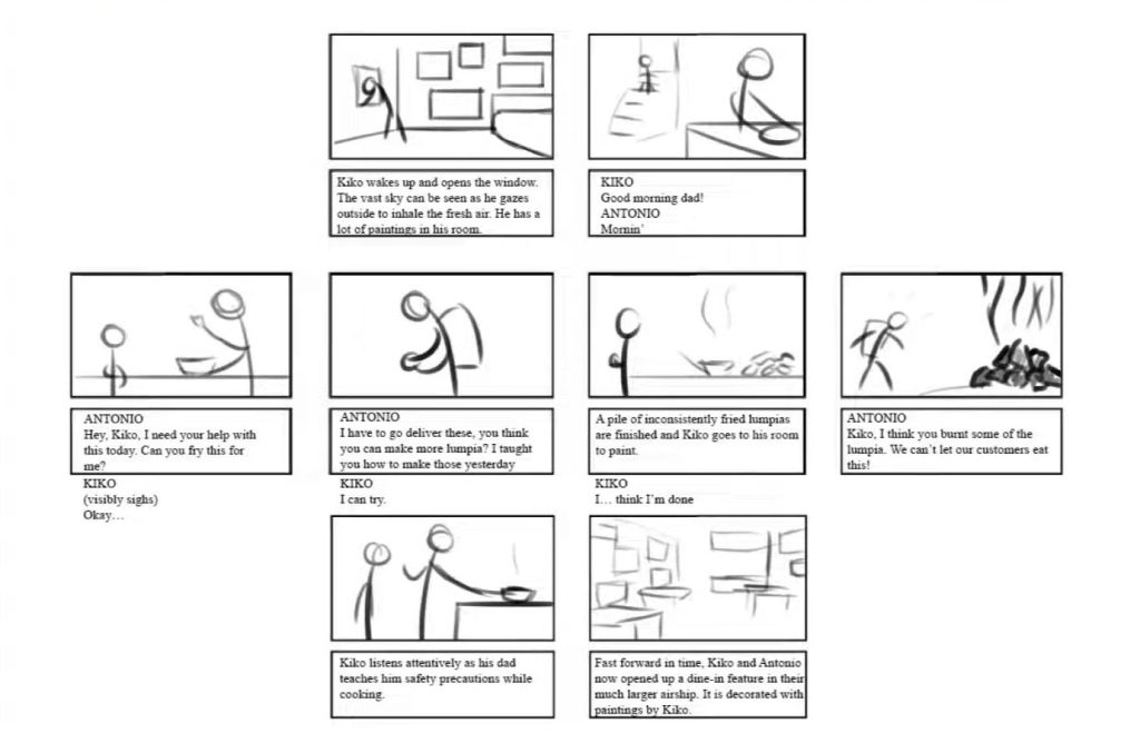
Start sketching a minimalist visual storyboard, focusing on simplicity.


Learn how to storyboard more efficiently from our guide on how to create a compelling storyboard for animation.
Recording Narration Thoughtfully
Use a clear, conversational narration voice that matches the friendly minimalist style. Allow comfortable pauses between sentences and ideas so concepts land cleanly before moving to the next point.
Adding Intentional Motion and Transitions
Bring your visual storyboard to life with subtle motion like pulsing icons or zooms to highlight key moments. Use basic wipes, pushes, and fading to transition between scenes. Avoid excessive movement.
Perfecting Timing and Pacing
Refine scene lengths, transition speed, and narration pacing to keep the video moving at an engaging yet comfortable tempo from start to finish. Every second should be intentional.
By focusing on these strategic elements, you ensure a strong minimalist foundation before bringing the visuals fully to life. Next, let’s go over a step-by-step process for assembling your explainer video smoothly.
How to Craft a Minimalist Explainer Video
Follow this workflow for putting together a simple yet compelling minimalist explainer video:
1. Clarify Your Core Message
- What is the single most important takeaway you want viewers to understand?
- Avoid the temptation for multiple or diluted messages.
2. Identify Supporting Points
- Brainstorm only essential facts, data, examples, etc. needed to reinforce your main message.
- Limit supporting points to 2-3 tops.
3. Script a Concise Narration
- Write a simple narration script focused on reinforcing your core message and supporting points.
- Follow the concise writing tips outlined in the section above.
- Time narration to last no more than 90-120 seconds.
4. Storyboard Complementary Visuals
- Sketch scenes with basic illustrations or product/service footage to support each narration line.
- Identify opportunities to further explain via visuals rather than narration.
5. Record Clean Narration
- Use an authentic, conversational voice when recording narration.
- Allow pauses between sentences and ideas. Read at a moderate pace.
6. Add Intentional Motion and Transitions
- Make parts of scenes move subtly to highlight or transition between key moments.
- Use simple scene transitions like fades, wipes, and pushes to move between ideas.
7. Refine Timing and Flow
- Tweak scene lengths, transition speed, and pauses to achieve ideal flow and pacing.
- Every second should feel polished yet comfortable.
8. Choose Complementary Music (Optional)
- If needed, add subtle background music without lyrics or a heavy melody that could distract.
- Avoid competing with narration.
9. Confirm Accessibility Features
- Double-check captions or audio descriptions are available for deaf/blind viewers if needed.
10. Export and Deliver the Final Video
- Export video in formats needed for each distribution platform.
- Upload and share your simple yet powerful explainer!
By following this strategic process, you can assemble a minimalist explainer video that both effectively educates viewers and leaves a lasting impact.
Examples of Excellent Minimalist Explainer Videos
It helps to learn from strong examples of companies that have crafted compelling minimalist explainer videos. Here are a few favorites to watch and dissect:
Shows how subtle motion guides the viewer through key features.
Minimalist Explainer Video for SaaS [Animated Infographics]
Illustrates restraint in visual elements while still feeling energetic.
Study these and other top examples to inspire creative choices for your own video. Now let’s drive home some key takeaways.
Key Takeaways for Creating Simple Yet Highly Effective Explainer Videos
To recap the core principles:
- Prioritize clarity and efficiency by removing any non-essential visuals, narration, or concepts. Simplify to amplify your core message.
- Strategically highlight information through clean visuals, motion and animated infographics, and narration pacing rather than overloading viewers.
- Write a concise script of around 150 words focused on your main message and 2-3 supporting points.
- Let visuals enhance the narrative, not compete with it. Use restraint with motion as well.
- Take an “educate don’t sell” approach that leaves viewers feeling informed rather than pitched to.
The minimalist style forces you to carefully curate only the most important ideas and present them as visually simply as possible. The effort required pays off with an explainer video asset that clearly and memorably educates viewers on your key messages.
Frequently Asked Questions About Minimalist Explainer Videos
Still have questions about successfully implementing minimalism with your next explainer video? Here are answers to some frequently asked questions:
Should I use background music in a minimalist explainer video?
Only subtle musical accents that complement the narration rather than compete. Avoid anything with distracting lyrics. Often best to nix music altogether.
What visual assets work best for a minimalist video style?
Basic geometric shapes, line illustrations, and limited real footage. Icons can help simplify complex concepts. Avoid photorealistic or intricate visuals.
How long should a minimalist explainer video be?
60-90 seconds is the sweet spot. Remove any content not vital so you naturally hit this length. Only go longer if essential to communicate core ideas.
Can I take a minimalist approach if my product/service is complex?
Absolutely! Minimalism helps simplify even sophisticated concepts by boiling down to just the essential explanatory elements. Remove complexity, not clarity.
What if my brand aesthetics aren’t that minimal? Should I overhaul?
Not necessarily! You can craft a minimalist explainer video without changing your broader branding style. Minimalism works for the video medium specifically.
Which tools are best for creating minimalist animation?
Apps like Adobe AfterEffects, Animation Maker, and VideoScribe allow you to easily build scenes with simple shapes, motion, and transitions.
Let’s Summarize the Key Principles
Hopefully, this guide has provided a clear sense of what makes minimalist explainer videos so effective when thoughtfully constructed. Keep the focus on:
- Efficient communication of your core message above all else
- Strategic use of complementary visuals and motion
- Restrained, conversational narration pacing and length
- Overall simplicity and crispness in aesthetic
Resist any elements in visuals, audio, or narrative that aren’t completely necessary. Simplify, simplify, simplify!
Transform Your Message With Animation


Done right, the minimalist explainer video style helps ideas come through loud and clear. This clarity and memorability leads viewers to walk away truly understanding your key messages and viewing your brand as an informative authority.
So embrace the power of simplicity, efficiency, and strategic negative space with your next explainer video. By mastering the art of minimalism, you’ll craft videos that inform and enlighten audiences in the most effective way possible. Just remember that sometimes, less is truly more!


