
Infographics are a popular and effective way to present complex data and information in a visual format. Animated infographics take this a step further by incorporating motion graphics to bring the data to life.
As a professional data visualizer and infographic animator, I’ve had the pleasure of bringing all kinds of datasets to life through motion over the years.
But it wasn’t always easy – when I first started out, I had to learn the hard way how tough it can be to take raw statistics and craft them into intuitive and engaging animated stories.
In this in-depth guide, I’ll share my insider tips and lessons learned for fellow infographic creators. By the end, you’ll have a deep understanding of how to wield animation as a powerful narrative tool to enlighten and inspire.
A Brief History of Animated Infographics
Static infographics have been around for centuries, with early examples like William Playfair’s economic graphs and Florence Nightingale’s visualizations of disease data. However, animated infographics are a relatively new phenomenon that emerged in the digital age.
In the early days of the internet, rudimentary animated gifs were sometimes used to add a sense of motion to infographics. But these were fairly crude and limited in scope.
The real breakthrough came with the advent of powerful animation software like Adobe Flash in the 1990s. This allowed for the creation of sophisticated motion graphics and interactivity.
Early innovators like Hans Rosling used these new digital tools to bring infographics to life through his Gapminder animations that visualized global development data.
He created interactive animations that showed how all the countries of the world have developed since 1809, which are freely available on the Gapminder website
Animated infographics started going viral on social media thanks to sites like Infogram which allowed designers easy creation and sharing.
Today, animated infographics have exploded in popularity and are used across all mediums – from explainer videos to dynamic digital displays. The increasing processing power of computers has enabled complex 3D and virtual reality animations to take infographics to the next level.
Well, enough history lessons! Now I’ll switch gears a bit and tell you about my entrance into this world.
My Journey Into Infographic Animation
I still remember the first animated infographic I created back in design school that sparked my passion for this medium.
We were assigned to present research on global carbon emissions trends, and I decided to turn the dry numbers into an animated map timeline showing emissions data by country over several decades.
The moment I saw the timeline play out visually, with country dots growing and shrinking dynamically based on real data, I realized the power of animation to turn abstract information into impactful knowledge.
Viewers gasped audibly when hotspots like China bloomed rapidly from green to red. That emotional connection and reaction affirmed my instinct that animated infographics could make a difference in how we engage audiences with data.
Since then, I’ve had the privilege of animating everything from public health PSAs to animated musical data sculptures. There have been plenty of lessons along the way.
Complex healthcare processes that left viewers confused when explained statically suddenly clicked once I broke them into stepped animated sequences. Painstakingly animated charts that took weeks to produce only to realize they failed to focus viewers on the core message.
But over time and experience, I’ve developed reliable frameworks to ensure my infographics inform first and dazzle only second.
This guide represents the best practices I’ve learned on that journey. My hope is that it provides a roadmap to help fellow designers harness the power of strategic animation and visual communication to create infographics that enlighten, engage, and inspire.
Laying the Foundation: Planning for Narrative Flow
For me, the most crucial work happens long before I ever open Photoshop or After Effects. No animation technique can save a weak core narrative, so laying the proper groundwork is essential.
I start every infographic project by clarifying three foundational planning elements:
Start by Identifying the Single Core Insight
Resist the temptation to highlight multiple data points. Isolate the one key insight or conclusion you want audiences to take away. This singular impressive focus guides all other decisions.
For example, if designing an infographic on climate change impacts, the core message could be: “Global CO2 levels have risen over 50% since preindustrial times due to human activities.” Any data not serving that precise point gets eliminated.
Choosing the Right Core Insight
When identifying your core insight, consider what will be most impactful and meaningful to your target audience. Focus on what will educate them, inspire them to action, or change their perspective.
Map the Data Story Arc
Outline the logical sequence of evidence building up to convey the core message. Think like a storyteller, planning the beginning, middle, and climax.
For our climate change infographic, the arc could be:
- Begin by establishing baseline pre-industrial CO2 levels
- Present data on post-revolution CO2 rise
- Show exponential acceleration since the 1950s
- Juxtapose current levels against pre-industrial baseline
- Highlight overwhelming scientific consensus attributing the rise to anthropogenic sources
This thoughtfully sequenced narrative reinforces the core message through data progression.
Crafting an Effective Arc
When mapping your arc, ensure each step logically builds on the previous one to create a natural flow. Use pacing and sequencing to build intrigue and momentum towards the core insight.
Visualize the Storyboard
With your arc defined, translate it into a rough storyboard visualization. Sketch out key moments and transitions to solidify the data narrative in your mind. Don’t get bogged down detailing individual elements yet.
Also, avoid detailed art at this phase – focus on high-level progression and transitions. Focus on the high-level flow.
Once I have this solid foundation mapped out, I can confidently begin bringing the infographic to life, knowing that each design choice ladders up to a focused message.
Rushing into animation before this framework is in place is one of the most common mistakes I see. No amount of visual polish can fix a flawed core narrative!
Storyboarding Effectively
When storyboarding, aim to capture the essence and flow of your narrative. Focus on conveying key transitions and moments. This will provide a guide for bringing your vision to life visually.
Choosing the Right Visuals for Your Data
Data visualization means showing information through pictures and graphics. The goal is to make the data easy to understand quickly.
Choosing visuals that match the type of data is very important. For example:
- Timelines work well for showing how things change over time.
- Bar charts are good for comparing amounts between different things.
The visuals should clarify the data, not make it more confusing.
Picking the right visuals for the type of information helps people understand it intuitively.
Effective Visuals for Time-Based Data
Line charts and bar charts over time are great for showing trends and changes over time.
The visual metaphor of time progressing along a line matches this type of temporal data.
For example, a line chart can showcase website traffic growth month-by-month.
Animated tickers that count up or down also show time-based changes well. For instance, an animated counter could display revenue growth over the year.
Timelines are another excellent match for time-series data. They can depict events unfolding sequentially over history.
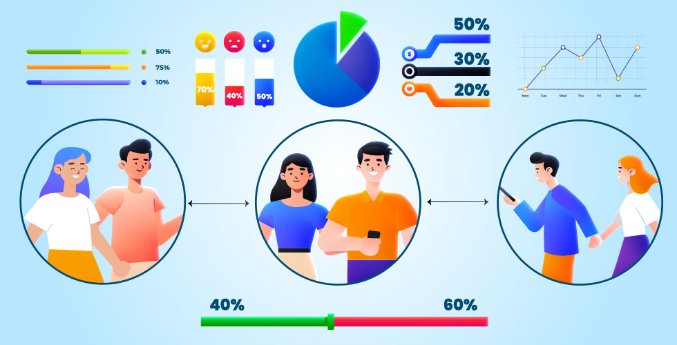
Visualizing Part-to-Whole Relationships
Pie charts make it very easy to see how parts make up a whole. Our minds innately digest fractional divisions when presented as slices of a pie.
For example, budget data can be easily grasped when categorized as color-coded slices of a total pie chart.
Stacked bar charts also allow viewers to quickly comprehend part-to-whole fractions as vertical sections of bars.
Proportional pictographic objects like scaled icons or illustrations work well too. For instance, a quantity like website visitors could be represented by proportionally sized crowds of people icons.
Showing Hierarchies and Ranking Relationships
Bar charts ordered vertically intuitively showcase hierarchical relationships and ranking.
Our brains naturally interpret higher bars as having greater precedence than shorter ones lower down.
Divided pictograms can also clarify ranking through visual grouping – more significant elements are depicted larger or higher up.
Tiered illustrations with higher tiers being more prominent visually further reinforce hierarchy based on vertical position.
Visualizing Geospatial Data
Maps work extremely well for grounding data in real geographic relations.
We easily internalize meaning when information is framed in a spatial context.
For example, plotting company locations on a map instantly conveys distribution and international presence.
Animated flow lines overlaid on a map region help viewers clearly understand movement patterns and trajectories.
Proportional symbols scaled and placed on maps proportional to real geographic data also work very well. Larger symbols depict greater measured quantities.
Explaining Processes and Systems
Sequential process flow diagrams enhance understanding of multi-step processes enormously.
Breaking down a complex system into logical visual chunks mirrors the layered sequencing intrinsically.
For example, the lifecycle of software development can be illustrated step-by-step to clarify the phased process.
Quantifying statistics visually
Displaying animated counters ticking up helps ground abstract numbers in tangible meaning. The motion illustrates the increasing statistic vividly.
Proportional pictograms can also add meaning to statistics that are hard to grasp as raw numbers alone. Showing each person icon representing some large amount conveys scale intuitively.
Animated scaling diagrams expand in proportion to statistical trends, quantifying growth in relatable visual terms rather than numerically.
In summary, picking visuals suited for the data type and relationships being conveyed is key for effective and intuitive data visualization.
Matching data patterns with appropriately matched visual encoding provides cognitive anchors for viewers. Developing fluency in fundamental visualization methods allows infographic designers to confidently select solutions optimized for intuitive communication of insights to audiences.
Data Visualization in Action – A Case Study of the “Cruise Industry”
Now that we’ve covered some key principles for choosing optimal data visualizations, let’s look at a real-world example.
10 Studio has prepared an excellent animated video that visualizes an overview of the Cruise Industry in Bangladesh. This provides a great case study for how data-driven motion graphics can clarify and engage audiences around industry research and analysis.
The video leverages various data visualization techniques we just discussed to present statistics and trends impacting cruise tourism in Bangladesh in an intuitive way. For instance, it uses:
- Animated charts over time showing historical growth trajectories
- Proportional icons quantifying scale and size
- Map routes and infographics conveying geographic data
- Sequenced storytelling revealing industry details step-by-step
By harnessing suitable visuals tailored to the information being conveyed, the video makes the key insights and narratives around the cruise industry in Bangladesh highly accessible and interesting.
Let’s take a look at this well-crafted example of informative and engaging data-driven motion graphics in action:
Directing Focus Through Strategic Animation
Animation provides a powerful tool for directing viewer attention in line with the planned narrative flow. It can help you show your data in a more interesting and clear way.
But you have to be careful not to use too much animation or the wrong kind of animation. You want to use animation that helps your viewers follow your story and understand your data better.
Here are some tips on how to use animation strategically:
Gradually Reveal Key Data
Sometimes you have data that is very important or surprising. You want to show it to your viewers in a way that makes them pay attention and remember it.
One way to do that is to use animation to reveal the data gradually over time, instead of showing it all at once.
For example, imagine you have a chart that shows how much money different countries spend on education. You can start with just the outline of the chart and then add one country at a time, from the lowest to the highest.
This way, you can build suspense and curiosity as your viewers wonder which country spends the most. You can also add some narration or text to explain what each country’s data means.
This technique of gradually revealing key data can help you direct your viewers’ focus and make them more interested in your data.
Reinforce Sequence and Flow
Sometimes you have data that is related or connected in some way. You want to show it to people in a way that makes them see how the data goes from one thing to another.
One way to do that is to use animation to make smooth changes between different data things or parts.
For example, maybe you have a map that shows how many people travel from one city to another by plane. You can use animation to draw lines or arrows between the cities, showing the way and amount of the flights.
You can also use different colors or thicknesses to show different kinds or values of the data. This way, you can show people how the data changes over space and time.
This tip shows how data flows can help you make your data more easy and clear to follow.
Guide Focus Through Movement
Some data is shy, hiding in the background. You want it to pop and catch your audience’s attention. Animation can do that by making data elements move or appear on the screen.
For example: You have a table showing how many people watch different TV shows. Use animation to make the numbers or bars slide in from the edge of the screen or grow from nothing.
You can also highlight or emphasize specific numbers or bars that are more interesting. This way, you direct your audience’s eyes to the data you want them to see.
This animation technique brings hidden data to the spotlight.
Transformations for Comparison
Sometimes you have data that is different or similar in some way. You want to show it to your viewers in a way that makes them compare and contrast it. One way to do that is to use animation to transform one data element into another.
For example, imagine you have a pie chart that shows how many people prefer different flavors of ice cream. You can use animation to change the size or color of the slices of the pie chart, showing how the preferences change over time or across groups.
You can also use animation to morph the pie chart into a bar chart or a line chart, showing how the data looks different in different formats.
This technique of transformations for comparison can help you make your data more meaningful and insightful.
Annotate Key Areas (Add Words to Data)
Complex data needs explanation. Label and call out important spots.
If you have a graph that shows how many people use different social media platforms, you can use animation to add labels with the names of the platforms, callouts with some facts or statistics about them, or underlines with some comments or questions about them.
This way, you can explain your data more clearly and make it more relevant.
Repeat Important Data
When your data is crucial, you want your audience to remember it. Repetition through animation can help you achieve this.
For example: You have a number showing how much money a company earned in a year. Make that number appear on the screen multiple times, changing its size, color, or position.
You can even make it flash, spin, or bounce. This repetition emphasizes your data and makes it stick in your audience’s minds.
Animation can be a very powerful tool for showing your data in a more interesting and clear way. But you have to use it wisely and carefully.
You don’t want to use too much animation or the wrong kind of animation. You want to use animation that helps your viewers follow your story and understand your data better.
These are some tips on how to use animation strategically. Try them out and see how they can improve your data visualization.
Optimizing Pace and Viewer Engagement
When you animate infographics, you want to keep your viewers interested and informed. You don’t want to go too fast or too slow. You want to find the right speed that makes your infographics easy to understand and enjoyable to watch.
Here are some tips to help you find the best pace for your infographics:
Apply Intentional Pausing
Sometimes, less is more. When you show an important statistic or fact, don’t rush to the next one. Give your viewers some time to process what they just saw.
Pause your animation for a few seconds before you move on. This way, your viewers can remember the information better and not feel overwhelmed.
Establish Rhythm Through Repetition
Another way to make your infographics more engaging is to use repetition. You can repeat some motion sequences or transitions to create a sense of rhythm and flow.
For example, you can zoom in or out every time you show a new insight. This will make your infographics more consistent and catchy.
Use Sound and Interaction Judiciously
You can also add some sound and interaction to your infographics to make them more dynamic and interactive. You can use music, sound effects, or user input to enhance your animation.
But be careful not to overdo it.
Use sound and interaction sparingly and strategically. You don’t want to distract your viewers from the main message of your infographics.
Finding the right blend of motion design, interaction, sound, and strategic pausing optimizes infographic pacing. Audiences remain engaged from start to finish without overload.
Best Practice for Accessible and Inclusive Design
Accessibility is essential for inclusive infographics to resonate across diverse audiences. The following practices help ensure your animated content reaches and satisfies all groups:
Offer Media Alternatives
At a minimum, provide text transcripts describing the full contents for those relying on screen readers. Also, include modalities like audio narration or voiceover where possible.
Give User Control Over Pacing
Let audiences pause, rewind, or slow down animated sequences. Speed controls also aid those prone to motion sickness.
Limit Reliance on Audio Alone
While sound provides an additional channel of information, critical data must also be represented visually. Offer mute capability as well.
Use Sufficient Color Contrast
Ensure visuals have adequate contrast between text and backgrounds for those with color blindness. Also, allow color scheme inversion.
With some forethought, we can create truly accessible and inclusive animated infographics that satisfy the needs of all users. Considerate design leads to more impactful and ethical communication.
Benefits of Animated Infographics
So why add motion to infographics in the first place? What do animations bring to the table that static graphics can’t provide? There are several key advantages:
Conveying Complex Data and Stories
Animation allows the viewer to visually process sophisticated data streams and narratives that could be overwhelming as static visualizations.
For example, animated charts that show how data has changed over time are much easier to parse than a series of separate charts.
Dynamic Visual Comparisons
Motion design enables clever transformations and transitions that highlight relationships and comparisons in a format that words alone cannot achieve.
Seeing two pie charts seamlessly morph into one before your eyes leaves a lasting impact.
Increasing Engagement and Memorability
Our brains are wired to pay attention to movement.
Animated infographics simply command more attention and engagement than their static counterparts. Viewers also have better recall with animations thanks to the “picture superiority effect.”
Explaining Systems and Processes
Some concepts and stories are intrinsically tied to motion, change over time, or sequenced steps.
Animation is ideal for explaining how dynamic systems work, from assembly lines to software workflows.
Condensing Timelines
Animated timelines are an incredibly effective technique for communicating broad historical narratives in a limited timeframe by condensing centuries into minutes.
The visual momentum keeps the viewer oriented without getting bogged down.
Boosting Social Media Sharing
On social media, motion graphics tend to generate more shares, likes, and reactions compared to static images. This virality makes them perfect for content marketing.
Best Practices for Animated Infographic Design
Now that we’ve covered why animated infographics are so powerful, let’s look at some key principles and techniques for creating compelling motion graphic designs:
Choose the Right Visual Format
Every infographic design begins with picking the right visual format. For animations, consider charts like animated bar graphs or donut charts that will transform well. Maps and timelines also work beautifully with motion.
Prioritize Key Data Points
Focus the animation on the most essential 2-3 data stories you want viewers to understand. Too many moving parts cause cognitive overload. Guide the eye using visual emphasis and audio cues.
Find the Right Pace and Timing
The timing and sequence of graphic elements appearing should align logically with the narrative flow. Mix rapid-fire moments with pauses to allow for absorption. Setting the pace wrong can lose the viewer’s attention.
Use Motion to Transition Between Ideas
Use slick motion transitions like wipes, fades, and zooms to move between key data stories and sections. This creates cohesion and “rewires” the viewer’s mental model in an impactful way.
Incorporate Interactive Elements
Within limits, adding interactive functionality like hover tooltips, clickable filters, or scrolling parallax creates dynamic user experiences. But don’t overdo it. Over-interactivity can distract.
Design for Quick Social Media Consumption
In the age of mobile phones and social feeds, animated infographics should be snackable. Convey key insights within the first 10 seconds in case viewers only watch part of the video.
Want to make your animated infographics captivate audiences across social media? Dive into this in-depth blog post for pro tips on optimizing animated infographics specifically for social engagement and sharing.
Enhance with Sound Design
A moving graphic with no audio feels incomplete to our brains. Sound design enhances motion graphics immensely through appropriate music, voiceovers by voice artists, and subtle sound effects. But don’t go overboard.
Blend with Live Footage If Possible
Blending animated charts and diagrams with real human footage helps viewers connect with the story in a more visceral way. This hybrid approach humanizes data.
Real-World Applications Across Domains
Infographic animation brings value across virtually all sectors. Here are some real-world examples:
Marketing
Companies use data videos to craft compelling narratives around products, achievements, and benefits.
For example, the nonprofit “Charity: Water” creates statistics videos highlighting global water access issues.
Government
Infographics help make public data accessible to citizens.
For instance, the EPA visualized the environmental impacts of energy sources through animated charts on its website.
The National Public Utilities Council created similar animations using the EPA’s data!
News Media
Newsrooms integrate motion graphics as dynamic explanatory journalism.
For example, the Washington Post illustrated shifting Congressional seats over time using animated maps.
The maps show how the 2020 presidential margin changed in different districts compared to the current and new boundaries, and how gerrymandering is reducing the number of competitive districts.

Education
Visual learning is enhanced through infographic tutorials and explainer content. For example:
- Animated biology diagrams bring concepts like cell division to life:
The versatile applications span virtually every industry. Whether crafting data-driven marketing pitches or clarifying public policy, animated infographics provide a powerful tool to inform, engage, and inspire audiences.
Tools of the Trade: Animation Software for Infographics
Animating infographics requires digital design tools. For beginners, the learning curve can be daunting.
Here’s a look at some popular animation platforms used by designers:
Adobe After Effects
After Effects is the industry standard software for motion graphics and is used to create the most modern animated infographics.
The interface is complex with a steep learning curve but provides unparalleled capabilities and integrates seamlessly with other Adobe software. After Effects works best for frame-by-frame animations.
Adobe Animate (formerly Flash)
Historically the tool of choice for vector animations and interactive content thanks to its timeline-based interface.
Adobe Animate outputs HTML5 content that works great on mobile devices. The downside is that Flash animations can’t integrate real footage.
Powtoon
A user-friendly cloud-based tool where you can make quick animations just by dragging and dropping elements into a timeline.
Comes with libraries of pre-made animated characters, shapes, and more. The flexibility is limited compared to advanced tools but Powtoon is incredibly easy to pick up.
Animaker
Another beginner-friendly online animation platform great for quickly turning out snappy social media videos.
Comes loaded with dozens of animated infographic templates and assets to modify. Exports video in different formats. Not suited for complex data visualizations.
Canva
Canva is an easy-to-use graphic design platform with many simple drag-and-drop animated video templates.
It allows anyone to quickly create animated social media posts and presentations without advanced design skills.
However, Canva has limited flexibility compared to more robust tools.
Blender
Free, open-source 3D creation software that can produce cinematic 3D animated infographics.
However, Blender is targeted at 3D artists so expect a very steep learning curve. Most infographics don’t require full 3D.
Programming Libraries like D3.js
For programmers inclined designers, D3.js and other code libraries allow you to animate infographics using JavaScript and SVG. This offers endless flexibility if you have the coding chops.
No one tool is inherently better than others. Choose software based on the design requirements, your skill level, and budget constraints.
Take Inspiration from the Masters of Animated Infographic Design
The world of animated infographics and motion design is vast with many brilliant designers pushing the boundaries of data communication.
Let’s look at a few industry leaders and pioneers whose portfolio of work serves as an inspiration.
Hans Rosling
No discussion on animated infographics is complete without recognizing the immense contribution of the late Hans Rosling.
A medical doctor and public health expert, he revolutionized infographic animations with the Gapminder Foundation to show global development trends.
Rosling’s famous TED talks and presentations with animated bubble charts are a joy to behold even from a pure design perspective. His pioneering work popularized animated infographics and set the stage for many others.
Nigel Holmes
A legendary designer who brought ground-breaking motion graphics to the pages of Time magazine decades before the tools were mainstream.
Nigel Holmes’ work integrated animation into editorial illustrations early on and showed how motion could improve visual storytelling in journalism.
He also wrote a book on “Joyful Infographics – A Friendly, Human Approach to Data”.
Information is Beautiful
Founded by British designer David McCandless, the Information is Beautiful studio specializes in transforming complex data into beautiful visualizations and infographics.
Their animations are widely shared on social media for their clarity in depicting everything from social issues to science.
Kurzgesagt – In a Nutshell
This YouTube channel with over 21 million subscribers is known for gorgeously animated videos that distill complex ideas into easily digestible formats.
Their signature “motion infographic” style uses flat custom illustrations to create compact explanatory micro-animations on technical and philosophical topics.
It takes the Kurzgesagt team hundreds of hours to make just one video!
Visual Capitalist
Their beautifully designed visual explainers on business, finance, and technology regularly go viral online.
Visual Capitalist seamlessly blends animated charts and diagrams with photographic elements to create in-depth explainer content that breaks down complex subjects.
TED-Ed Animation
For over a decade, this team of animators under Andrew Foerster has produced award-winning animated videos and lessons covering diverse topics for TED-Ed.
Their video style marries quirky kinetic motion design with factual rigor. The studio collaborates with educators to create custom animations that accompany lessons.
Showcase: Breakdown of Sample Animated Infographic Styles
To highlight the incredible diversity in animated infographic design approaches, let’s analyze examples of popular animation styles from different creators:
Minimalist Motion Graphic Style
This pared-down aesthetic focuses purely on animating simple shapes, icons, and text elegantly. Backgrounds are muted. The emphasis is on clean lines and typography.
Want to apply minimalism beyond video? Master the craft of crafting elegantly minimalist yet profoundly impactful explainer videos and infographics through this insightful blog post.
Alternatively, Observe how this Vanity Fair video explains Brexit using minimally animated diagrams. Lines draw themselves on cue and small icons move across the screen.
Flat Illustration Style
Here custom 2D illustrations are created with flat graphics, vivid colors, and quirky characters. The playful visuals are brought to life through subtle and charming animations. Great for explainer content.
Example: Weird History’s “The Petty Feud That Almost Destroyed Paleontology” uses bright illustrated scenes accented with animated charts.
Photo Hybrid Style
Blending animated infographics with real human footage results in explanatory videos that feel highly authentic and cinematic. This hybrid style combines motion design with live-action shooting.
Example: Wendover Productions’ video on Chinese high-speed rail integrates animated maps and charts with train footage.
Cut-out Animation Style
This technique involves animating characters and scenes composed out of paper or card-cut style illustrations. The effect ranges from surreal collages to intricate paper puppets.
Example: BBC Ideas’ video “The power of introverts” features vibrant cut-out figures against illustrated backgrounds, with seamless scene transitions.
Stop Motion Animation Style
Physical objects, clay figures, paper cut-outs, or drawings are moved frame-by-frame and photographed to create jumpy, imperfect life-like motions. Adds tactile charm.
Example: Polly Matter’s “How Singapore Fixed Its Housing Problem” uses minimalist paper props animated against illustrated cityscapes to build miniature dioramas of urban planning concepts.
Vector Motion Graphic Style
Vector animations use mathematically defined curve paths and typography instead of raster images. Scales infinitely without losing visual quality. After Effects and Adobe Animate are commonly used to achieve this look.
Example: Grist’s video “The climate tipping points that could change the Earth forever” combines sleek vector infographics with indoor videography in perfect harmony.
3D/CGI Animation Style
For complex concepts, 3D animations leverage sophisticated rendering tools to build virtual environments and photo-real visuals with depth and immersive camera motion.
Example: Kurzgesagt’s “The Solar System — our home in space” employs detailed 3D renderings of sprawling data centers to vividly tell the tale of how our search queries travel across internet infrastructure.
In Closing: The Future of Animated Infographics
Over the past decades, animated infographics have gone from being a novelty to an essential multimedia tool for engaging modern audiences across devices and platforms. But this is just the beginning.
Let’s briefly speculate on fascinating possibilities as technology evolves:
Augmented and virtual reality opens up new ways to immerse viewers in animated data worlds. AI-generated animations could allow automated customization.
The rise of data visualization libraries like D3 allows developers to innovate new formats. Developments like real-time motion tracking and gesture control could add more interactivity.
Human imagination combined with ever-improving digital tools will only push the boundaries of data communication further.
We’ve come a long way from rudimentary bar charts and timelines. Today’s vibrant world of animated infographics would have been unimaginable just 20 years ago.
The most exciting part is that pioneers like yourself are shaping the future of this medium. By leveraging these remarkable animation technologies, you have the power to make sense of the world’s complexity.
Our planet faces no shortage of existential challenges and divides. Your ability to enlighten and inspire action through compelling animated narratives has never been more crucial.
So get out there – and bring those data stories to life! The tools are in your hands. Dazzle us.